Illusion (or hallucination?)
As I write this, it gets me feeling philosphical as if I will write about the illusions in life — like how time is relatively illusive or that life is longer than we think it is.
I am afraid I am not going to drop more bombs. I will tell about a straight-forward illusion I came across when I was building a cover for blurrit.
Context
I love playing with Typography and other minor details. I love it even more when people are able to identify them.
A few examples subtle flex.
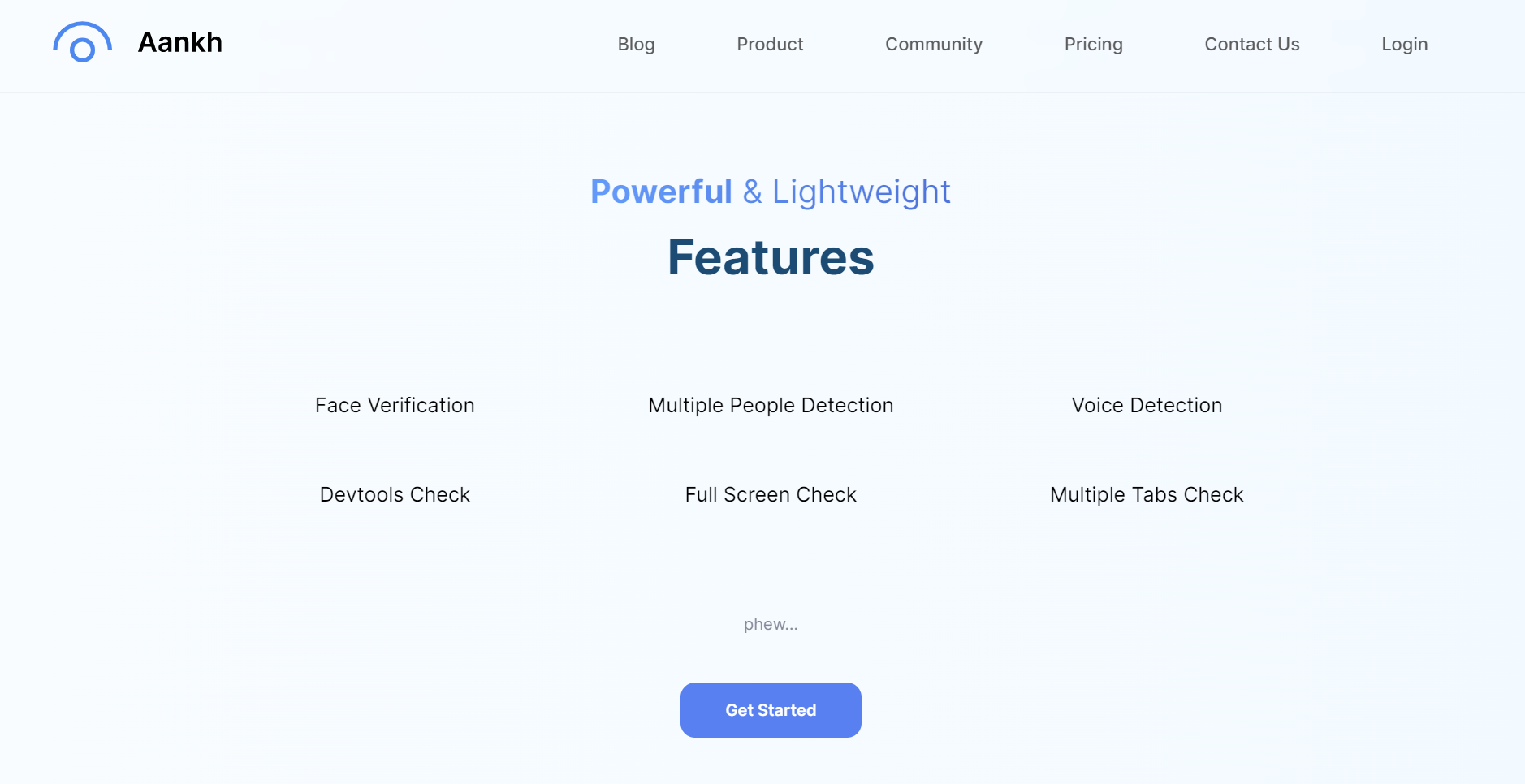
- Second segment for landing page of Aankh.
- Typography for Powerful & Lightweight features.
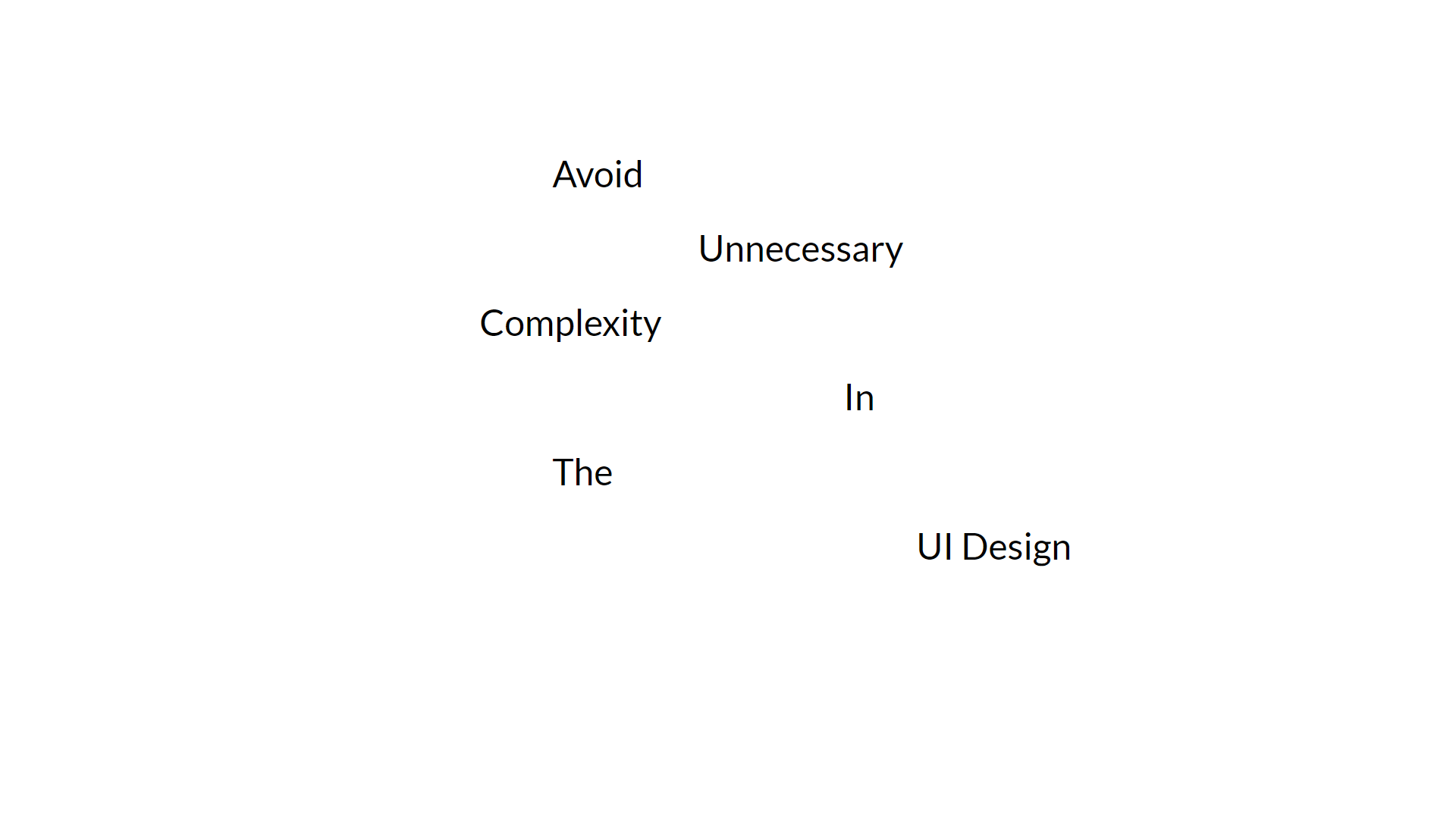
- A snippet from the slides of Fundamental Design Principles.
- Again, I know I am not supposed to explain jokes, but this is ironical (And low-key proud of it.)
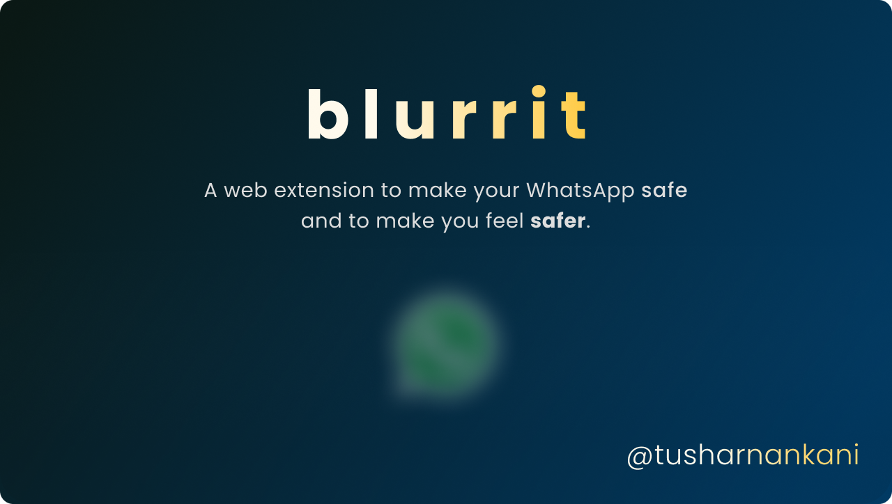
- A snippet of the cover of blurrit.
- safe is bold, safer is bolder.
But wait, where is the illusion I was going to speak about? (Sorry, I get distracted when I start speaking about things I am passionate about.)
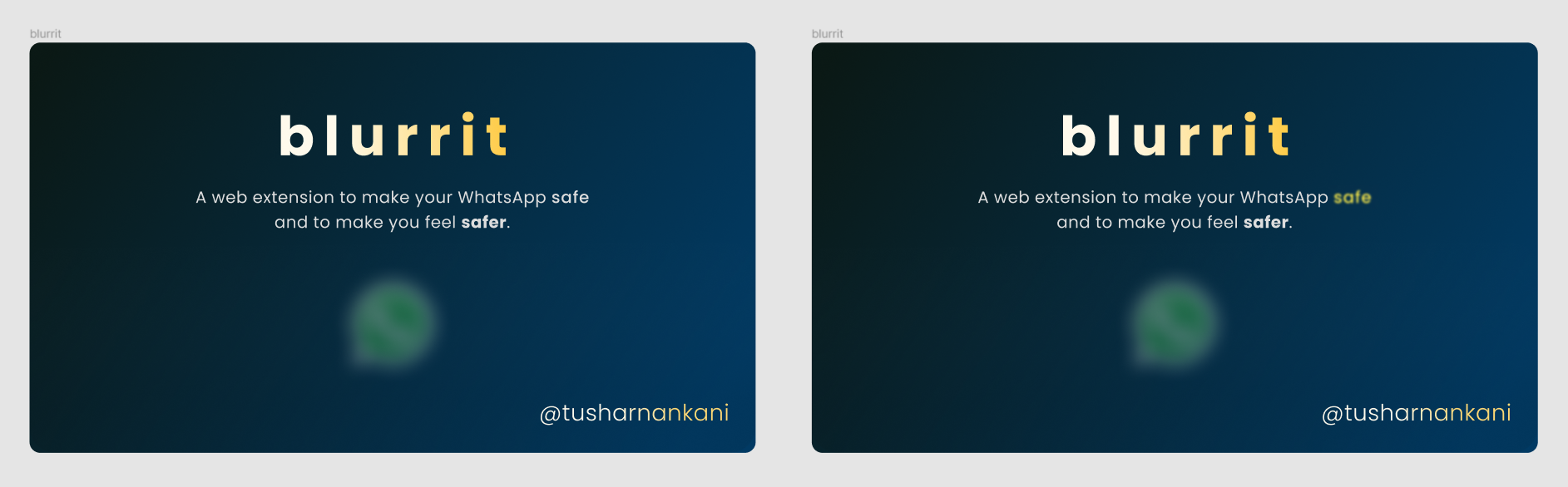
Here is the previous attempt before I finalised the cover of blurrit.

Now, when I was comparing the two, I noticed something.
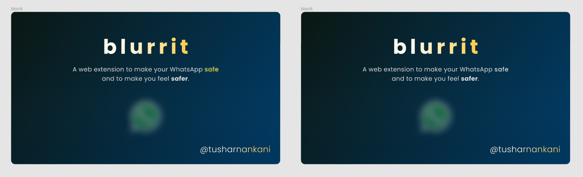
Do you see any difference? (Apart from safe.)
Hopefully, you'll see a difference in background gradient. (Or you have a brilliant vision.)
But, I haven't made any changes.
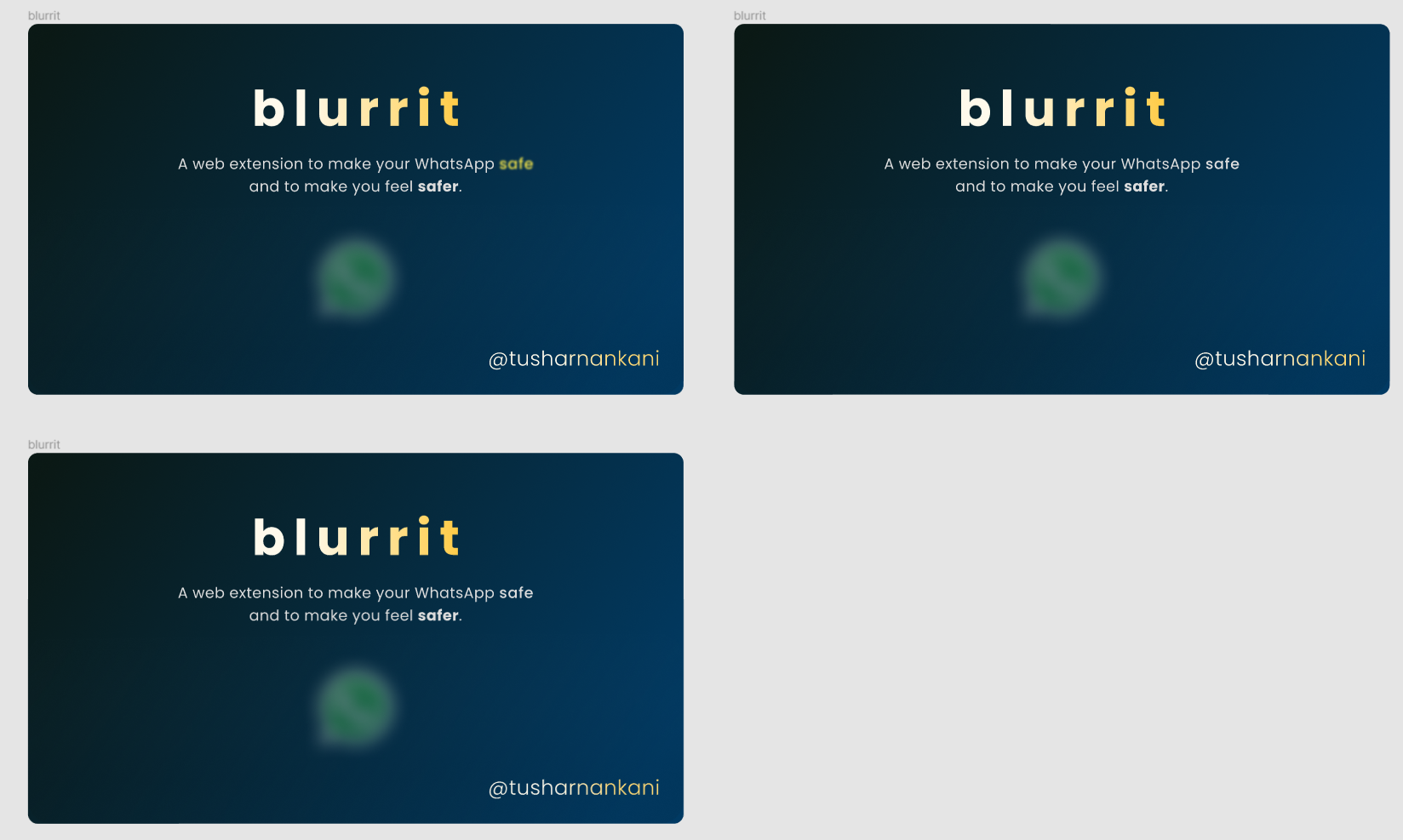
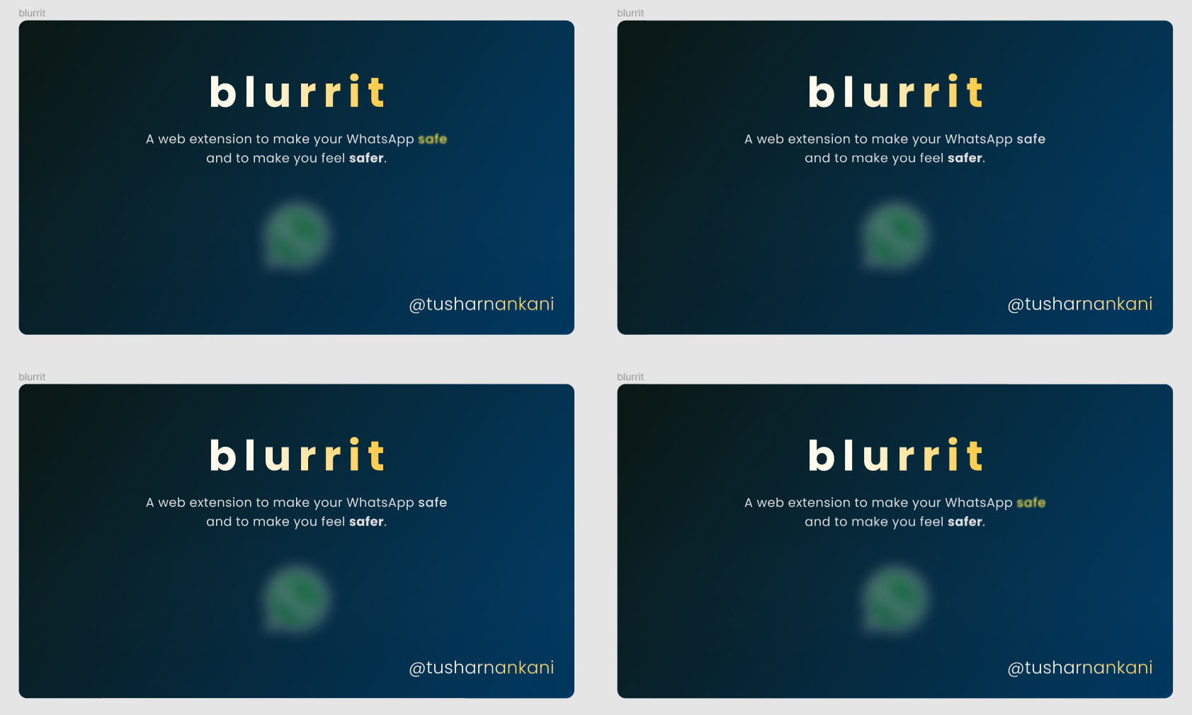
Now, let's swap the images.
Don't believe me? Here's another one to confuse help you.
This is a very famous optical illusion. Also, called the color gradient illusion. But is it common sense?
Relativity plays a major role in most of the optical illusions. Decieving the perception of your conveniently inter-wired retinal and brain cells is crucial in illusions like the Ponzo illusion.
In this case, we tend to compare the right side (lighter) of the first one with the left side of the second picture.
Hence, in comparison, the blue appears to be lighter in the first one and the black appears to be darker in the second one.
Interestingly, the conclusion to my every experience remains the same: Zoom out.